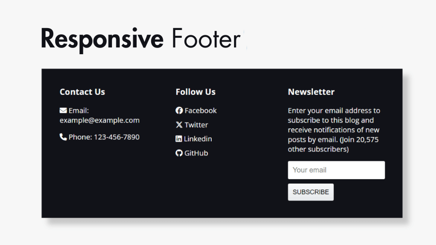
Footers are essential components of web design, providing important information and navigation options for users. In this step-by-step tutorial you will learn how to create a responsive footer for your website, complete with contact information, a newsletter subscription form, and social media icons.
Step 1: Create HTML structure for the Footer
First, let’s set up the basic HTML structure for the footer. We’ll divide it into three sections: contact information, social media links, and newsletter subscription.
<!DOCTYPE html>
<html lang="en">
    <head>
        <meta charset="UTF-8" />
        <meta name="viewport" content="width=device-width, initial-scale=1.0" />
        <title>HTML & CSS Responsive Footer</title>
        <link
            rel="stylesheet"
            href="https://cdnjs.cloudflare.com/ajax/libs/font-awesome/6.5.1/css/all.min.css"
        />
        <link rel="stylesheet" href="./styles.css" />
    </head>
    <body>
        <h1>HTML, CSS Responsive Footer</h1>
        <footer>
            <div class="container">
                <div class="footer-content">
                    <h3>Contact Us</h3>
                    <p>
                        <i class="fa-solid fa-envelope"></i> Email:
                        [email protected]
                    </p>
                    <p><i class="fa-solid fa-phone"></i> Phone: 123-456-7890</p>
                </div>

                <div class="footer-content">
                    <h3>Follow Us</h3>
                    <ul class="social-links">
                        <li>
                            <a href="#">
                                <i class="fa-brands fa-facebook"></i>
                                Facebook
                            </a>
                        </li>
                        <li>
                            <a href="#">
                                <i class="fa-brands fa-x-twitter"></i> Twitter
                            </a>
                        </li>
                        <li>
                            <a href="#">
                                <i class="fa-brands fa-linkedin"></i>
                                Linkedin
                            </a>
                        </li>
                        <li>
                            <a href="#">
                                <i class="fa-brands fa-github"></i> GitHub
                            </a>
                        </li>
                    </ul>
                </div>

                <div class="footer-content">
                    <h3>Newsletter</h3>
                    <p>
                        Enter your email address to subscribe to this blog and
                        receive notifications of new posts by email. (Join
                        20,575 other subscribers)
                    </p>
                    <div class="subscribe">
                        <form action="">
                            <input
                                type="email"
                                name="email"
                                placeholder="Your email"
                                required
                            />
                            <input type="submit" value="Subscribe" />
                        </form>
                    </div>
                </div>
            </div>
        </footer>
    </body>
</html>
Step 2: Style your Footer structure with CSS
Now, let’s style the footer to make it visually appealing and responsive.
/* Adding Custom Font using Google Fonts */
@import url("https://fonts.googleapis.com/css2?family=Open+Sans:wght@400;700&display=swap");

* {
    box-sizing: border-box;
}

body {
    margin: 0;
    padding: 0;
    font-family: "Open Sans", sans-serif;
}

footer {
    background-color: #111218;
    color: #ccc;
    padding: 40px 0;
}

.container {
    display: flex;
    justify-content: space-between;
    flex-wrap: wrap;
}

.footer-content {
    flex: 1;
    padding: 0 40px;
}

.footer-content h3 {
    margin-top: 0;
    color: #fff;
}

.footer-content ul {
    list-style-type: none;
    padding: 0;
}

.footer-content ul li {
    margin-bottom: 10px;
}

.footer-content ul li a {
    color: inherit;
    text-decoration: none;
}

.footer-content ul li a:hover {
    color: #ffffff;
}

.subscribe form {
    display: flex;
    flex-wrap: wrap;
    gap: 10px;
}

.subscribe input {
    padding: 10px;
    outline: none;
    border: 1px solid rgba(0, 0, 0, 0.1);
    border-radius: 3px;
    font-size: 16px;
}

.subscribe input[type="submit"] {
    cursor: pointer;
    background-image: linear-gradient(#f7f8fa, #e7e9ec);
    box-shadow: rgba(255, 255, 255, 0.6) 0 1px 0 inset;
    text-transform: uppercase;
    font-size: 14px;
    user-select: none;
    -webkit-user-select: none;
    touch-action: manipulation;
}

@media (max-width: 768px) {
    footer {
        padding: 20px 0;
    }
    .footer-content {
        flex-basis: 100%;
        margin-bottom: 20px;
        padding: 0 20px;
    }
}
Step 3: Add social media icons to the Footer content
We’ll use Font Awesome for social media icons. Therefore we have Included the Font Awesome library in the HTML file:
<head>
    <!-- Font Awesome stylesheets -->
    <link
        rel="stylesheet"
        href="https://cdnjs.cloudflare.com/ajax/libs/font-awesome/6.5.1/css/all.min.css"
    />
</head>
Font Awesome provides various icon classes that you can use directly in your HTML. For example, <i class="fa-brands fa-facebook"></i> will display the Facebook icon.
Step 4: Make it responsive
We need to media queries to make the footer responsive for different screen sizes. In the provided CSS code, we’ve already included a media query that adjusts the layout for screens smaller than 768px wide.
@media (max-width: 768px) {
    footer {
        padding: 20px 0;
    }
    .footer-content {
        flex-basis: 100%;
        margin-bottom: 20px;
        padding: 0 20px;
    }
}
Finally, we’ve learned how to create a responsive footer with HTML, CSS, and social icons. Footers are an essential part of web design, providing valuable information and navigation options for users. By following these steps, you can create a visually appealing and functional footer for your website.
Feel free to modify the styles and content according to your website’s needs. If you have any questions or need further assistance, don’t hesitate to ask!